EN
EN  DE
DE  RU
RU  PT
PT  JA
JA  ES
ES  IT
IT 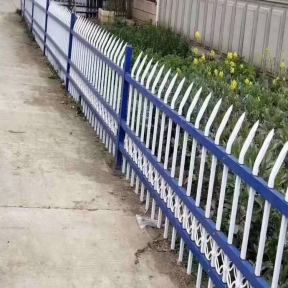
You’ve poured endless thought and resources into your home. You’ve curated the interior, cultivated the garden, and created a space that reflects your standards. Now you face a final, daunting decision: the fence.
For many homeowners, this feels like a step backward. The common fear is that a fence, by its very nature, will be a cage—an oppressive boundary that shrinks your yard, blocks your view, and diminishes the very beauty you’ve worked so hard to create.
What if this entire perspective is wrong?
What if a fence could do the exact opposite? What if, instead of being a barrier that hides your landscape, it could be the one element that elevates it? The key is to stop thinking of a fence as a wall and start seeing it as what it truly should be: a picture frame.
A great frame doesn’t distract from the art; it enhances it. It defines the space, focuses the eye, and communicates a sense of intention and value. Your fence can do the same for your property. Here’s how to adopt that design-centric mindset.
Principle 1: Embrace Permeability to Create Expanse
The single biggest mistake that makes a yard feel small and “caged” is choosing an opaque fence. A solid wood or vinyl fence creates a hard, abrupt visual stop. Your eye travels across your beautiful lawn and—thud—it hits a wall. The world beyond ceases to exist, and your property’s perceived size shrinks to that exact boundary line.
The first principle of using a fence as a frame is permeability. You want light and vision to pass through it.
This does more than just preserve your view; it creates a sophisticated layering effect. Your curated garden remains the foreground, but the “borrowed landscape” beyond—the neighbor’s tall oak tree, the distant sky, the shifting afternoon light—becomes the background. This interplay between foreground and background adds depth and makes your own space feel larger and more integrated with its surroundings.
This is where material science directly impacts aesthetics. To achieve this elegant transparency, you need pickets that are as slender as possible, with generous spacing in between. A material like wood or vinyl requires thicker, bulkier components to ensure strength, resulting in a heavier, more “fenced-in” look. A weaker metal might require more pickets placed closer together to meet safety codes, creating a busy, cluttered feel. High-strength steel, found through quality metal fencing supplies, however, allows for incredibly slender yet robust pickets. This superior strength-to-slenderness ratio is the secret behind the most successful designs. It provides uncompromising security while creating the minimalist sightlines needed for the fence to visually “disappear,” leaving only the beautiful frame around your landscape.
Principle 2: Command the Eye with Deliberate Lines
A fence is one of the most powerful linear elements in your landscape design. Its lines will direct every visitor’s gaze, whether you intend for them to or not. A masterful design uses this to its advantage.
Think about the primary lines of your fence:
Vertical Lines (The Pickets): The rhythm of your vertical pickets sets the tempo. Are they tall, proud, and spaced widely for a sense of formal dignity? Or are they grouped more closely in a repeating pattern for a more decorative, textured look? This rhythm should complement your home. A clean, even beat suits a modern design, while a more complex rhythm can match a traditional or ornate one.
Horizontal Lines (The Rails): The top rail is arguably the most important line of all. It’s the upper edge of your frame. A clean, simple top rail creates a crisp horizon that draws the eye across the landscape, making it feel wider. A decorative top rail with scrolling details or added flourishes becomes a feature in itself, best suited for homes that embrace ornamentation.
When these lines work in harmony, the fence ceases to be the focal point. Instead, it becomes a subtle, guiding force that says, “Look here. Look at this beautiful garden. Look at this well-kept lawn. Look at this stunning home.” It actively presents your property like a gallery presenting a masterpiece.
Principle 3: Communicate Quality Through Substantial Details
The difference between a basic utility fence and a true architectural feature lies in the details. These are the finishing touches that communicate permanence and uncompromising quality.
The Posts: Fence posts are the anchors of the design. They should feel substantial and deeply rooted. Undersized posts make the entire installation feel temporary and weak. Properly scaled posts, especially at the corners and on either side of a gate, provide a sense of stability that mirrors the foundation of your home.
The Gate: Your gate is the official handshake of your property. It’s the one part of your fence that people physically interact with. A lightweight, flimsy gate that rattles when you close it sends a message of cheapness and weak security. A heavy, substantial gate that swings smoothly and closes with a satisfying, low-pitched thud communicates immense quality and safety. It’s a tactile experience of the investment you’ve made.
The Caps and Finials: Don’t overlook the very top of your posts. A simple, elegant cap or a decorative finial is a small detail that has a huge impact. It’s the period at the end of the sentence. A minimalist flat cap reinforces a modern aesthetic, while a classic ball or spire finial can provide the perfect traditional flourish. This small choice is a final opportunity to tie the fence’s design language directly to your home’s.
So, as you move forward, try to re-frame your own thinking. You are not building a barrier. You are not installing a security device. You are commissioning a frame for the art that is your home. By choosing the right metal fencing supplies and by prioritizing permeability, commanding the lines, and perfecting the details, you will create an architectural element that doesn’t just protect your property, but actively enhances its beauty, its character, and ultimately, its value.